When deciding who I should aim my work at I would need to look into the background of Royksopp like the genre of music they make and their fanbase. Being a electronic duo, fans of the electronic genre would obviously have an interest in their music, I wanted to not only appeal to the electronic genre fans but also their current fanbase. This would allow me to appeal to a wider audience with my work. With the proposed targeted audience of 18-25 it gives me a starting point of who to aim my work at however with a secondary target audience or 26+ allows me to aim the music video at everyone else. By wanting to connect with the audience on a personal level as well as many other levels within my work and through many different techniques this will allow me to target a huge audience. The more range you have for a music video the more popular it will become and therefore making the song more successful. With having a primary targeted audience of 18-25 it allows me to hone in on what I would need to create, due to me being within the targeted demographic it allows me to aim the video at myself as I would be within the target audience for the project. With multiple things happening on screen at the same time, with the fast tempo music and bright colours it will keep the audience engaged which is the primary reason of a music video. You want the audience to continue to watch it and tell their friends this creates a knock on effect and allows the video to gain popularity. With all this taken into consideration I could target an audience whilst creating my work.
Author Archives: Matthew Webb
Final Idea and My Aims
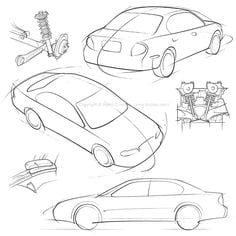
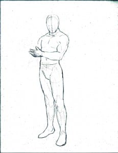
After looking at the brief, researching into different themes and styles I had a solid plan on what I wanted my work to look like and how to achieve this. Wanting a rough sketch theme for the assets that would be animated in a flowing way that would disassemble and then reassemble into something completely new for each scene. Sketching each asset myself I would have complete creative control of this project as said in the brief that was provided. My aims are to connect the animations and illustrations with the lyrics of the video, engaging with the audience and make them think not only about the lyrics but also what is happening on screen. I also want the video to connect with the audience on a personal level, by leaving the details out, like a face of a character, the audience will fill in the details theirselves and this will make it more personal to each audience member and not just a general targeted audience. I also want to connect with the audience through colour and narrative, this allows multiple platforms the audience can connect with if not all of them. By having a black background and colourful illustrations it would allow the audience to focus more on the animation as it makes the colours more vibrant and by having a narrative the audience are able to follow the animation easier and again connect with it on a personal level. I want to create a professional looking product that flows freely, engages with the audience and something that I can be proud of. After the final product is complete due to the actual competition being over and the winner being picked I would attempt to contact Royksopp and get some feedback on my work which would be a huge benefit to my project.
Research into Sketching
Before starting the designs for the video I wanted to research into the different styles of sketching to expand my knowledge and to get some inspiration for my work. There are many different styles of sketch and although I already know what I wanted my work to look like by researching the theme it would allow me to change aspects of my work to make it as professional and as good as possible as well as allowing me to possibly show different styles of sketch if I wanted to. I looked at some articles on how to actually draw, and how to add detail showcasing different ways to sketch and create something from scratch, from cartoon drawing to realistic. It allowed me to look at different ways of drawing and try them out for myself although this article didn’t show anything that I was looking for in terms of the theme for my work it allowed me to get a rough idea on how to sketch something and the way to go about it (https://design.tutsplus.com/articles/realism-photorealism-and-style-in-drawing–cms-21630). I then wanted to look into my theme, not just drawing in general as this would allow me to begin planning out how I would be sketching my work. Another article I looked at showed a few different types of styles that I could research if I wanted but again none were in the style that I wanted to do my work in (http://www.dummies.com/art-center/performing-arts/drawing/how-to-identify-common-drawing-styles/).
I started to look at pictures of the type of style I wanted to do to not only show how I wanted my work but to be able to examine them and research into it further.
I want a rough sketch theme, as I feel it would fit into the theme of the music and will allow me to connect everything within the video and flow freely. Not only this but I want everyone to be able to connect with the video and I feel by having the basics of the animation there people will be able to fill in the details theirselves which will allow them to connect with it on a person level as they will fill in the details from either a memory or just on the stop again making it more personal to each person viewing it.
Although these drawings are simple I want mine to be a little less refined and more hectic allowing me to unravel the drawings and make them become something else like said before allowing them to flow and the video to continue simply and effectively. To be able to animate the illustrations effectively I would need to sketch a front, side and back view of each asset so they could be animated professionally.
Researching Music Videos Part 3
After researching into colour and how the background can make a huge difference within a video I needed to look into the actual theme of my video which is a sketchy theme. I wanted to use a sketch theme as the video could easily flow well and I thought it would work well with the kind of song it is, matching it to the kind of genre it is and taking inspiration from other music videos. The main video where I got the sketch theme idea from is a-ha – Take On Me. This iconic video has a huge sketch theme going on within the video, although its mixed with actual footage and the the sketch theme is still gave me inspiration and ideas for my work. The sketches are very detailed and mine are going to be less detailed, the reason for this is because I want as many people as possible to connect with it, and by having no faces just the animation/illustrations people will be able to put their own face on the character and make it personal to them. There is however very little use of colour within this video and I think it can at times feel quite dull and boring by just having black and white, hence why I will be using a lot of colour within my video. This video is the main inspiration for the sketch theme I want to create however with the other videos I have looked at I have taken small parts from those videos and thought how I would want that to look like within my work. After analysing each key aspect for the video I have some great foundations for my music video.
Researching Music Videos Part 2
After looking at a music video with the same kind of theme I wanted to recreate within my work I then needed to look at colour. I wanted to see how other videos use colour to get some inspiration and to see how and when to use colour and how it can change the mood of a video. The perfect video to express this would be Coldplay – Hymn For The Weekend, within the video there is a huge use of colour however dull grey surroundings are also used to make the colour more vibrant and stand out to the audience. Like the previous video I looked at, a dull background is used to bring out the colour within the video, not only this but it makes the audience pay more attention due to the colour looking so vibrant because of the dull surroundings or plain colours. There are many different colours happening at one time in the video, and they’re constantly changing again keeping the audience engaged, something I would want to mimic within my work. Colour is very important within any video it can express the mood, theme it can even give hints away in a film of whats about to happen. So having the colour always changing will match with the song and the theme I want to give off, that life is always changing and nothing is ever a constant.

